A few days back an Architect I follow on twitter, Mark (@ArchitectMark), wrote a brief blog post about some website trends he’d spotted with his website traffic.
Below is the graph he’d posted on his blog.
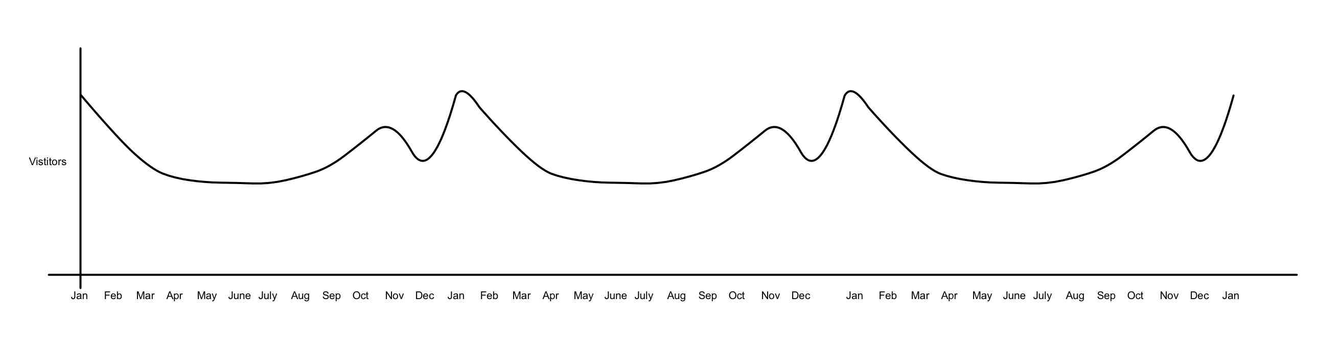
As you can see from the chart, his website traffic peaks at the beginning of the year and dips during the summer months for the past 3 years. Mark also pointed out that January is usually when people are at home wanting to kick start those construction projects so traffic peaks at those times.
We then had a discussion about how Architects could utilise Google Adwords as a tactic to target people searching Google for ‘architects in [insert your local area] just for those busy periods online. Could be a good £250 well spent if you can convert 20 enquiries say over the 2 busiest months online.
What was interesting for me though was the typical web traffic graph for product manufacturer websites which I’m so used to seeing.
After spending 4 years analysing various product manufacturer sites it’s pretty clear what a typical trend line should look like for a building product manufacturer website.
Here is the same graph but with an added line for a typical product manufacturers website.
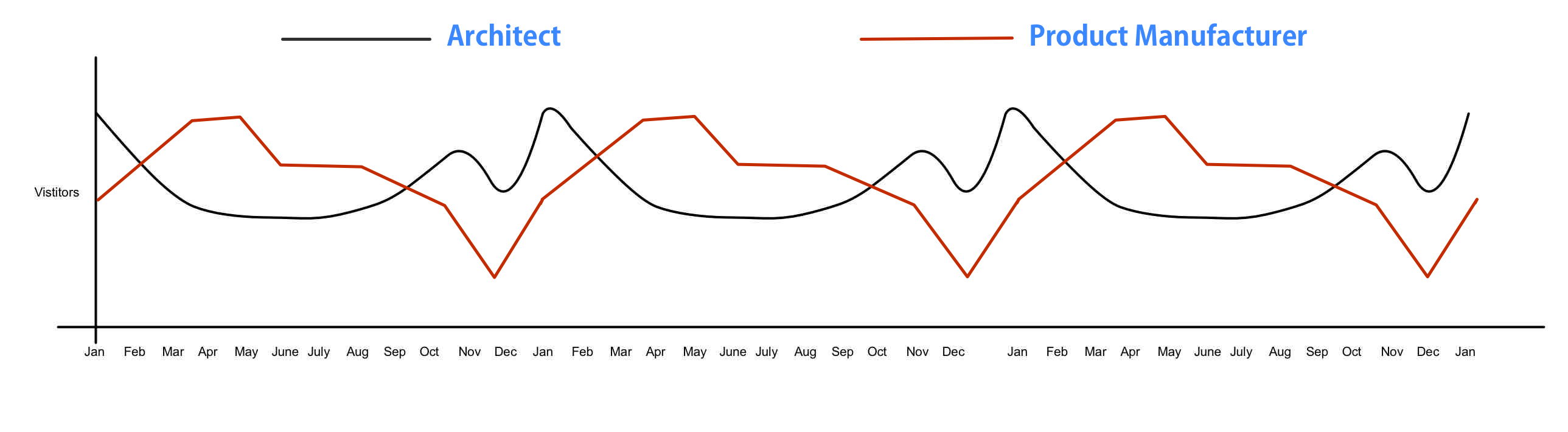
Interesting eh?
Firstly, it would be good for more Architects to confirm if their web traffic is similar to Mark’s.
Secondly, it’s interesting to see that the could be a bit of a flow between various stages of a project. Client to Architect to Product.
Would be good to add a trend line for a Builder and then a Subby maybe.
[button link=”http://priteshpatel.me/services/analytics/”]I’d like to know more about how Analytics can help me[/button]